Encouraged by the recent reaction to a much earlier blog post on some paint colours of the past I thought it worth revisiting the subject.
Introduction
Some fifteen years ago, in giving a talk to the Interior Decorators and Designers Association (now BIID), I suggested that this “latest fashion” for historical paint colours was worthy of more than just superficial treatment, and how, if treated in a thoughtless way, it would have unfortunate knock-on implications.
I didn’t, for a moment, expect my audience to listen and, sure enough, they didn’t. Several manufacturers have since brought out ranges of such colours, but rarely has sufficient care been taken with either their selection or description. The inevitable result is that a large element of parody and confusion has crept in. Although too late to be able to reverse this in any effective way I hope that a few basic points can be made clear.
Historic Colours
It may be a small and somewhat pedantic matter, but you will note that there is a clear difference between the terms “Historic Colours”, and “Historical Colours”. By “Historic Colours” we surely mean “memorable colours, or those assured of a place in history”. There are few of these, by definition, two which spring to mind being perhaps:

Tyrian Purple the purple dye extracted from a type of Mediterranean whelk, and used to colour the robes of Roman emperors, and…
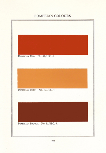
Historical Colours
“Historical Colours”, on the other hand, are those paint colours that were used in the past for the decoration of walls and woodwork. More specifically, they are colours that were used in the past as they were originally intended. Not colours as they have been distorted by light, dark, weather, age, chemical reaction, or “over-interpretation”. Implicit in this, perhaps, is that they are also colours that saw a certain amount of usage, not just “one-offs”. They should be colours that were in general use.
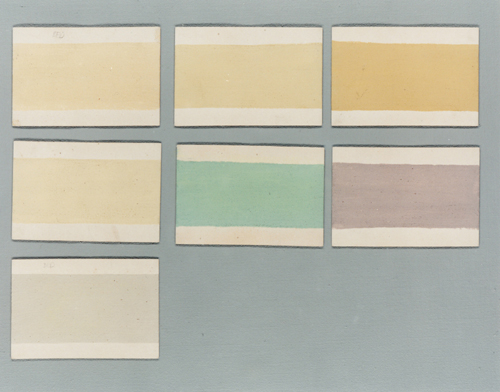
When I say “over-interpretation” I mean the deliberate “tweaking” of colours to fit into perceived notions of the past. The problem with this is that, rather like a game of Chinese whispers, notions of what was done, or what was used in the past become distorted the further they are transmitted…to such an extent that without even having studied the subject, everyone now seems to have an idea of what colours were used in the past. These ideas sometimes border on the fantastic and this has been exploited, to a degree, by commercial interests.
Adam Green, Soane Yellow, Dining Room Red, Invisible Green, Dutch Pink, Shaker Blue… these are all colour names that get bandied about, but perhaps we have never stopped to think about their origins. Perhaps we use the names without considering whether they mean the same thing to all of us. Certainly, when many customers at Papers and Paints start to describe colours to me it often takes a while to appreciate what they are actually looking for.

Indeed, rather like the colour that I am often asked for…”French château shutter blue“…perhaps the name is purely an idea that encompasses, a certain combination of light, texture, and an indeterminate range of hues, that is in the eye of the beholder alone.
One Should Question
If one is faced with the decoration of a room in an historical building how can one find out which of these ranges of “Historical Colours” are worthy of consideration? A few questions will quickly establish the serious contenders.
Were any of these colours ever used as they are shown on the cards? Who says so? Was it that nice man in the paint shop; the all-to-brief blurb on the back of the paint chart with the impressive heritage credentials; or the talented designer friend who “knows about these things”?
Has anyone sought to check? Does anyone really care? Frankly, does it really matter?
Well no, it doesn’t matter what colours people use on their walls, nor does it matter what people want to call these colours. If they want to evoke some distant past…a past set in the land of Copper Kettledom, if they want to be able to walk from their Georgian-style drawing room, through their dining room with its touches of Carl Larsson, to their Shaker-inspired kitchen, then fine (after all it’s what is frequently labelled “eclectic” – apparently another style in its own right). No sane person would attempt to prevent this in an ordinary domestic context.
I feel very strongly, however, that it does matter how these colours are marketed. My concern about the careless, unchecked, and occasionally dishonest use of colours, and their names and associations, is that within a short time this misinformation is accepted as gospel by many of those responsible for looking after our built heritage. The evidence for this can already be seen in many of the buildings administered by various heritage organisations and will certainly be a hallmark of the 1990s.
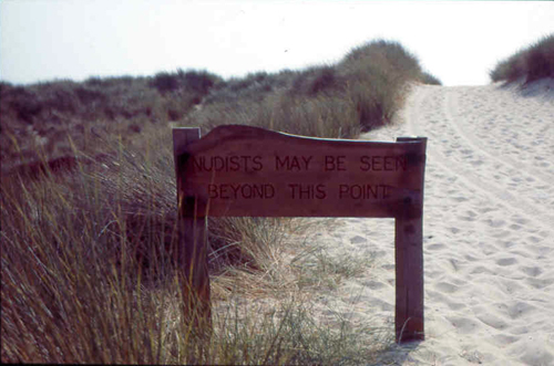
Naturists May be Seen Beyond this Point
Organisations like the National Trust, for example, are very good at informing one about the more obvious things such as the presence of naturists on their beaches, or the contents of their houses, but one seldom hears the reasons behind their use of paint colour. By no means is this unique to that organisation. Subliminally the visitor will soak up the colours in those houses open to the public and make assumptions as I did when I started investigating over twenty five years ago.
True Colours
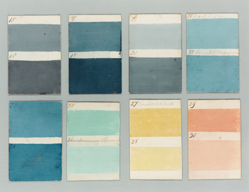
The Traditional Colour range by Papers and Paints is still the only uncorrupted range of colours that have been matched to late eighteenth / early nineteenth century colour samples. Other ranges might have started off with that intention, but have been radically altered as other colours have been added to “fill in the gaps”.
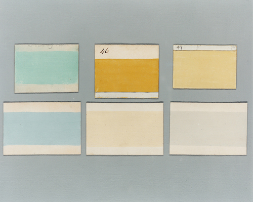
Some of the original 1807 colours were shown in the earlier blog post. The others can be seen in this one.
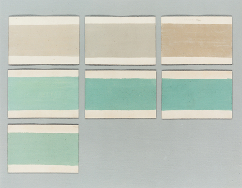
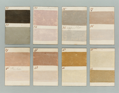
Each of the colours in the Traditional Colours range has been matched and mixed using between four and eight colourants in order to produce a unique effect that is as close to the original as possible. The vitality and complexity of colour that results ensures that any attempt to match these colours with other manufacturer’s paints will result in disappointment. Our colours are often described as having “texture” and “depth”.
View Larger Map




This is very interesting post to me because, you've guessed it, we are in the middle of a house refurbishment. The many conversations Husband and I have had about what colour our 19th century farmer's cottage with rendered walls should be would make even you as a colour specialist yawn. People keep suggesting Farrow & Ball green for woodwork but I resist thinking this would not have been the colour used originally. Can you advise?
Congratulations! You have won a Creative Blogger Award. It's all terribly exciting! Just visit http://daintyballerina.blogspot.com/2010/03/creative-blogger-award.html and all will become clear
Thank you very much (he said belatedly). What an honour.
Fanatastic post, beautiful colours.
Dear Patrick,
I found you by looking up Evangeline Bruce’s Albany apartment. The yellow of the living room is perfection. John Fowler did the decoration, and I am thinking that Nancy Lancaster had a big hand in it as well. I have discovered natural powdered pigments and have been using them in our office and home. The depth of color is fabulous. The colors are alive. No comparison to store-bought colors. If I were starting a new career,instead of retiring from my old one, I would love to come and study with you. I did not know that there was anyone out there doing what you do. I’m so happy that this history will now die.
Sincerely yours,
Belinda Sweet
Thank you Belinda. How kind of you. Sadly, when I worked on the Evangeline Bruce apartment the Fowler scheme had already been overpainted. Although appreciative of much of his work I remain cautious about his approach to the decoration of many historic buildings – as you can read here.
I am trying to source Hidcote Blue paint whichI saw on my recent vsiit, is used on the buildings at Hidcote Gardens. Farrow and Ball apparently mixed it for the National Trust but are unwilling to supply me.
Having carried out the paint analysis this can be done. My colleagues at Papers and Paints – http://www.papers-paints – will be able to help you.
[...] 1807 House Paint Colors- Found on patrickbaty.co.uk [...]