Patrick has already written about the background to the range of 1960s paint colours that he produced for Papers and Paints a couple of years ago. However, there have been a number of requests for guidance in their use. There is no doubt that some of the colours might overwhelm a small room if used by themselves, but that is not how they were originally planned.
Use of Colour
It was understood that the use of harmonious colours in a room was a safe option, but likely to lead to uninteresting results. Things could be livened up by introducing a small amount of a complementary colour into the furnishings, perhaps on a door or even on a single expanse of wall. The idea of the “feature wall” was born.
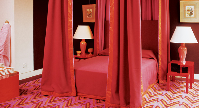
Suggestions for the use of colour were offered in a number of books on decoration published at the time. Not only were particular types of colours recommended for the different rooms in the house, but sometimes more detailed directions were given depending upon the outlook of the room. For example, one facing south and getting a lot of sun will appear cooler if the main wall areas are decorated in a pastel tint of a cool colour. A west-facing room, on the other hand, receives soft afternoon light and can therefore accommodate stronger colours.
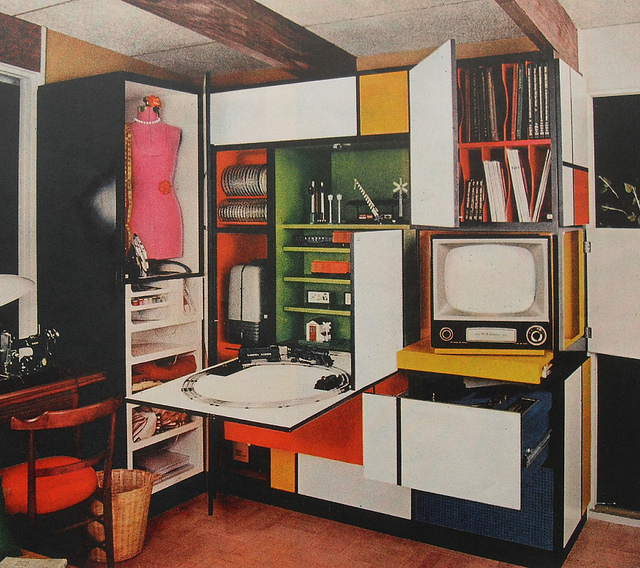
One book suggested that brighter colours could be used in the Dining Room as this room was not occupied for much more than an hour at a time. A full colour could be employed in the Kitchen, too, in order to stimulate the mind, but, we are told, it should be placed against neutral wall tints to reduce eyestrain. Any welcoming colour that is warm (yellow- or red-containing) should be used in the Entrance Hall, but purple should be reserved for very large halls alone. Intriguingly, the Bedroom, being the woman’s domain, should be painted in a colour that flatters her natural colouring, whilst tying in with the furnishing fabrics.
Basic tips on the choice of colours were as follows:
1) Consider the room as a whole and establish what colours will work with the furnishings;
2) Choose colours most suitable for the use that the room is put to;
3) Select pastel cool colours for warm rooms and warm colours for cool rooms; receding (cool) colours for small wall areas and advancing (warm) colours for large wall areas.
4) Add areas of complementary full colour to enliven pastel tints;
5) Pastel tints have high reflective value.
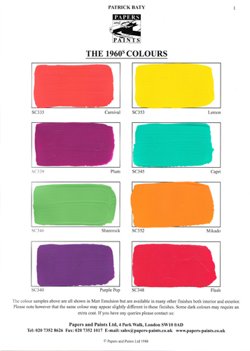
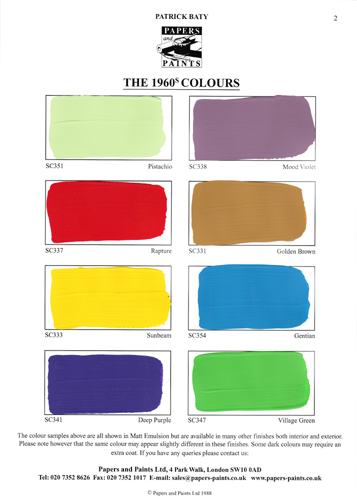
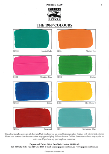
The names selected for these colours are designed to reflect the 1960s. Deep Purple and Purple Pop will be obvious, but others such as Norwegian Blue, Golden Brown and Capri will only mean something to those “of a certain age”.

Of course, there’s no reason why one shouldn’t enjoy the colours for what they are. Nothing like them will be found on other commercial paint ranges.
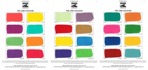
The 24 colours shown below are a selection of these colours and are designed to supplement the 1950s range that Papers and Paints produced in 2003. When used together in an appropriate manner a real flavour of the period can be given.
View Larger Map




No comments yet. Be the first!