
A current project on London’s Cafe Royal reminded me that I had a wonderful catalogue of paints that were manufactured in the 1930s and that might provide useful source material. Parsons’ Decorative Finishes is superbly illustrated and provides detailed information on many of the colours and finishes that were popular at that time.
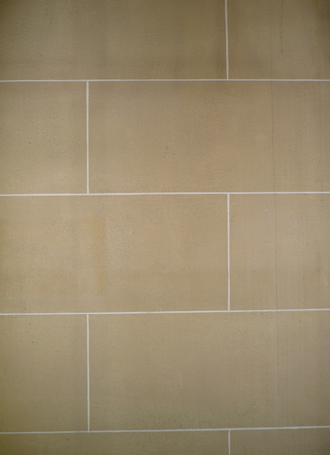
In the lobby to the Cafe Royal’s Celestine Room an area of original decoration had been exposed by the removal of a large mirror. The wall had been coated with a stone-coloured textured paint and lined out to resemble ashlar. I had remembered that several of the pages of the Parsons’ book featured a product of theirs called Parso-Stone.
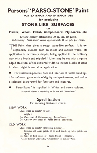
This was a paint that was designed to give a “rough stone-like surface” on interior and exterior walls. It was recommended for “vestibules, porches, halls and interiors of Public Buildings” as it provided “an air of dignity and spaciousness”.
The surface would be given a coat of a special undercoat – in this case Undercoating Parso-Stone – in order to ensure a non-absorbent finish. When this was dry the Parso-Stone itself was applied.
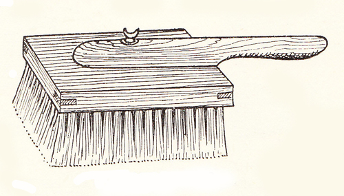
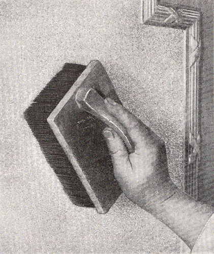
The texture was provided by the addition of either silver sand or stone dust and the paint had to be laid on in a thick coating. As this required a great deal of effort and tended to wear brushes out it was frequently applied by spray gun. It couldn’t be thinned as this made it very difficult to ensure even distribution over the whole surface. Once the area had been covered the coating would be stippled in order to remove brush marks and to provide a more stone-like texture. This was done by pounding the wet paint with a Stippler (stippling brush). As a general rule two coats would be given and each of these was stippled.
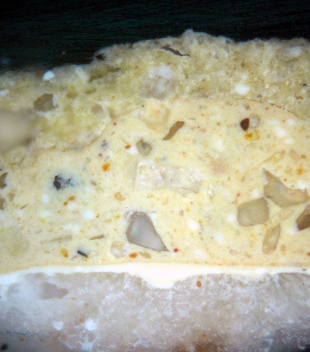
A cross section of the textured paint from the Cafe Royal is shown below. Here it can be seen that two coats had been applied over a primer.
In order to imitate mortar joints a straightedge was used. However, as this was done while the second coat of stone paint was still wet a couple of small nails would be driven in at each end of the straightedge, so that they projected about 6mm from the wall (one work recommended using steel gramophone needles). The straight-edge would be rested on these and would be prevented from making actual contact with the paint film. A chisel-pointed stick or screwdriver blade would then be drawn across the wall to scribe a line. Once the paint was dry a thin brush would be used to apply a white line along the scribed surfaces.
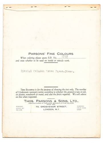
It was clear that the original owner of my copy of Parsons’ Decorative Finishes had asked for a sample of this paint in a non-standard colour. For (used as a bookmark) was a 24cm x 18cm card in a stone-blocked celadon green:
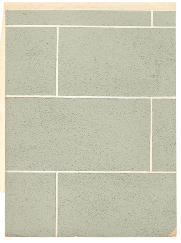
One of the secrets of producing a convincing effect was to introduce a certain amount of irregularity when the joints were being set out. The combination of appropriate colour and well executed technique provided a very durable and attractive finish.
Some years ago, while carrying out the analysis of the 1930s decorative schemes in Eltham Palace, I encountered the same finish on the walls of the ground floor corridor. In that instance the original decorating schedule had survived and the imitation stone effect was produced using a product called Stic B.
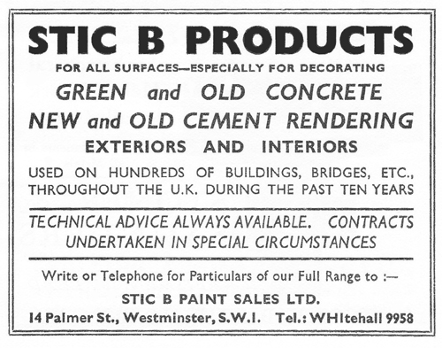
The material of Stic B was analysed for its contents, using the scanning electron microscope. It was found that the bulk of the material was silicon (a large percentage coming from the sand) and calcium (from the chalk). Aluminium and magnesium were present, possibly in the form of hydrated magnesium aluminium silicate (Attapulgite). This latter would have been added as a thixotrope to prevent sagging of the thick, and heavy, paint film on a vertical surface. Small amounts of zinc, barium and sulphur, showed that the material was made opaque and white by the addition of lithopone (a co-precipitate of zinc sulphide and barium sulphate).
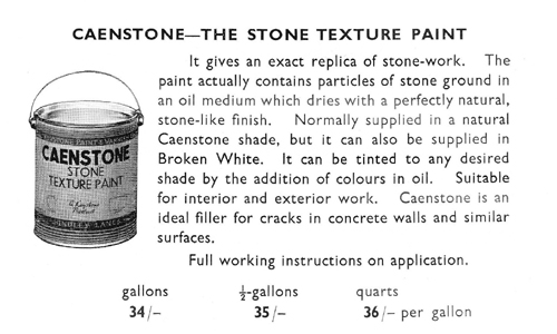
The use of textured or ‘sanded’ paint has a long history. The DIRECTIONS for PAINTING produced in the 1730s by the London colourman, Joseph Emerton, describe how the tops of weather-boarded houses might be protected. Having applied two coats of oil paint a third coat should be applied and while this was still wet dry sea sand should be sifted over the surface. Once dry the excess sand should be swept off and the process repeated. Finally, once the loose sand was brushed away, a coat of lead coloured (grey) paint should be applied.

A similar process could be employed to imitate Portland Stone on chimney-pieces; doorcases; posts etc. by using “White, or Writing Sand” (silver sand). I have encountered sanded finishes on a number of projects – notably the walls of the South and North Halls at Wilbury; in the Library at Newhailes, the Chapel in the Royal Hospital, Chelsea and at The Athenaeum.
Builders’ price books of the early nineteenth century frequently list sanding as an option and suggest that an extra six pence was charged per square yard treated.
The same process was also employed in the United States during the eighteenth and nineteenth centuries. In the early 1980s Frank Welsh, the American paint researcher, described how he had supervised the repainting of the exterior of Thomas Jefferson’s house at Monticello using dry sand from the Rivanna River. He had followed the instructions written by George Washington, in connection with his own house at Mount Vernon:
“Some years ago, I had…a quantity of fine white sand for the purpose of sanding my houses anew…(I wish you would have a little of the whitest finest and softest of the free stone at the wharf…pounded fine and run through a meal sifter of middling fineness, to see if it would not answer as well, or better than sand. To ascertain the difference with certainty between the sand and pounded stone take two pieces of plank (plained, a foot square each will be sufficient) and paint them in the usual manner with white lead grd. in oil and after the first coat is dry give them a second (the paint a little thicker) and while it is fresh throw (the board standing perpendicular on one edge) sand against one, and pounded stone against the other, as long as they will stick, and till every part of the paint is well covered. You will then, when they are dry, be able to decide which will look best and most resemble stone…”
1930s Paint Colours
Should anyone want to use any of the paint colours shown on these colour cards Papers and Paints will be able to match them in most conventional finishes.
View Larger Map


[...] on the still-wet paint so that it dried with a stone-like texture. A later version can be seen here. A Niche to the R/H of the Entrance The Stowe House Preservation Trust was founded in 1997 in [...]