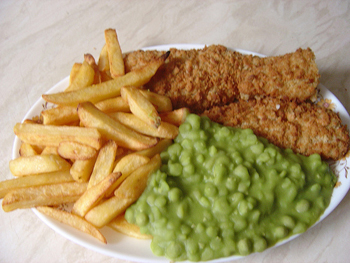
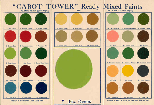
Pea Green is a colour name that immediately conjures up an image, but on reflection is it the colour of fresh peas, frozen peas, tinned peas or (forgive the accent) mushy peas that it brings to mind?
The name Pea Green, or the older one – Pea Colour, has been in use for hundreds of years, but the earliest that I can find it used in relation to paint is in a work first published in 1734. In William Salmon’s Palladio Londinensis it is listed amongst the ready-mixed pastes offered by the London colourman Alexander Emerton and which ranged in price from between 8d and 12d per pound.1 To give this some context, the cheap Common Colours were charged at 4d or 5d per pound and (by far) the most expensive – Fine Deep Green at 2s 6d per pound.2 In order to produce a paint the one pound of paste would be further ground with linseed oil and this would be sufficient to paint about 8 square metres.3

It is clear that in the second half of the eighteenth century Pea Green was considered a special colour.
In 1759 Lady Caroline Fox had her dressing room painted pea-green colour to match some china. The gallery at Osterley Park was painted “pea green” by 1772.4
In 1771 Sir William Chambers wrote to a client, for whom he was building a house in Berners Street, London:
“If you have any Particular fancy about the Painting [of] your principal Rooms be pleased to let me know[.] my intention is to finish the whole of a fine stone Colour as us[u]al excepting the Eating Parlour which I purpose [sic] to finish pea Green with white mouldings & ornaments.”5
In the same year, Mrs Philip Lybbe Powys noted that the breakfast-parlour at Fawley Court in Buckinghamshire, had Pea Green walls with a gilded border and a chimney-piece of green marble with gilt ornaments.6
In 1810, the German poet Goethe wrote of green:
“The eye experiences a distinctly grateful impression from this colour…The beholder has neither the wish nor the power to imagine a state beyond it. Hence for rooms to live in constantly, the green colour is most generally selected.”7
in Fitzroy Square – © Christie’s
Recipes
The recipes for producing a Pea Green varied depending upon their date and also whether it was an oil paint or a Soft Distemper that was being made.
Prior to the introduction of chrome yellow to the house-painter’s palette in the late 1820s, Pea Green in an oil paint tended to include verdigris in the recipe. In the fascinating manuscript of paint recipes entitled MISCELLANEA CURIOSA or a Memorandum of Many Useful Receipts, which dates from 1795-1816, a Pea Green oil paint was made up of:
3oz Pale or washed Massicot
4oz Paris white [a fine grade of chalk]
2oz Distilled Verdigris [a purer form of the pigment]
Ground in Linseed oil.
A small handbook published in New Haven in 1812, by Hezekiah Reynolds, entitled Directions for House and Ship Building suggested mixing one pound of verdigris with ten pounds of White Lead to make Pea Green for exterior purposes.
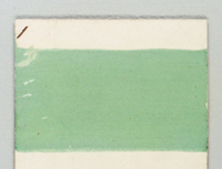
Peter Nicholson, in his The Mechanic’s Companion of 1825 gives the pigment Mineral Green as the main component of Pea Green.8 However, this is a very imprecise name and could mean several things – variously Scheele’s Green or a number of copper chloride or copper sulphate pigments. The above sample comes from a collection of distemper samples that date from 1807 and this was labelled Mineral Green on the reverse. Could it have been meant as a Pea Green?
An early nineteenth century recipe for producing “A cheap colouring for the walls of rooms in dwelling houses” would certainly give the heebie-jeebies to the Health & Safety people:
“Take four pounds of Roman Vitriol, and pour it in a gallon of boiling water; when dissolved, add two pounds of Pearl Ash and stir the mixture well with a stick, until the effervescence ceases, then add a quarter of a pound of pulverized yellow arsenic, and stir the whole together; let it be laid on with a paint or white wash brush, and if the wall has not been painted before, two, or even three coats will be requisite. If a pea-green is required, put in less; and if an apple-green, more of the yellow arsenic.”9
T.H. Vanherman, a London colourman, illustrated how colour names were very imprecise and that there was a degree of flexibility in the way that colours were produced:
Pea-Green, Sage-Green, and Drab-Green.
“Are formed with Spruce Ochre and Prussian blue, and then lowered with white; or, if black is substituted for the blue, you will have a variety of different greens; and substituting Raw Umber, instead of the Ochre, you will obtain another distinct set of greens. All these tints are chosen, and likewise all the middle-tint drabs, on account of their repose to the sight, and their solid and quiet tone.”10
The last sentence has echoes of Goethe’s thoughts on green quoted above.
Green Verditer was a frequently quoted component of Pea Green. For example in an early edition of Laxton’s book of builders’ prices of 1818 it was listed as being amongst the most expensive colours applied by a plasterer. The cost per yard being:
| Wash, stop, and | common colour | 0 | 4 |
| Wash, stop, and | Straw colour | 0 | 5 |
| Wash, stop, and | Buff colour | 0 | 5 |
| Wash, stop, and | Lemon colour | 0 | 6 |
| Wash, stop, and | Grey colour | 0 | 7 | Wash, stop, and | Blue colour | 1 | 2 |
| Wash, stop, and | Pea Green, with verditer | 1 | 2 |
Furthermore, Laxton described Pea Green as a “tender tint along with blue verditer, lilacs, pinks etc.”11
Later recipes usually include Chrome yellow and Prussian blue in their ingredients.12
Examples
Pea Green appeared in two important nomenclatures of colour and, inevitably, there was a difference of opinion.
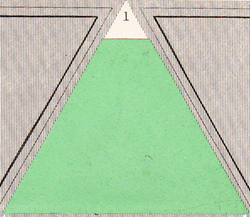
In David Ramsay Hay’s Nomenclature of Colours… he offered this as Pea Green:
He said:
“In the popular nomenclature of colours, the tints of green have a greater number of appellations than those of any other colour, as will be observed in the sequel. But the only one of these that can be applied to a pure tint of this colour, with the exception of light or pale green, is the well-known one of pea-green, (Figure 1;) all the others being modified either by the predominance of one of their constituent parts, or by their being gently neutralized with red.”13
Robert Ridgway, the American ornithologist, who produced his Color Standards and Color Nomenclature shows a much bluer version:
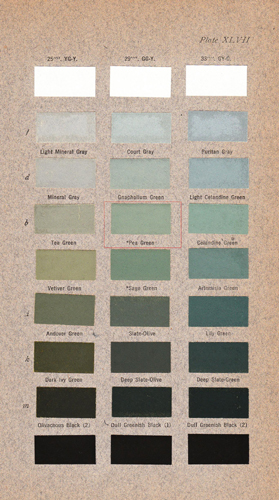

An example of Pea Green appears in both the Wilson Colour Chart and also the slightly later Horticultural Colour Chart of the late 1930s. Note how it refers to the 1934 British Colour Council Dictionary of 1934 and also Robert Ridgway’s work. It did not appear as a colour in the Réptertoire des couleurs published by the Société française des Chrysanthémistes in 1905.

The British Colour Council Dictionary of Colours included this amongst the 378 colours in 1949, saying of it:
“An eighteenth century colour name standardised by B.C.C. in 193414 and determined by W. in 1938.”15
Availability of Colours
As with almost all of the colours shown on this site those shown here could be mixed into conventional modern paint by Papers and Paints Ltd. The striking SC271 shown in the photograph of the first floor room of the Georgian Group is one of those in the Traditional Colour range.
Notes
1 (ibid. 63).
2 More can be learnt about the different prices charged in The Hierarchy of Colour in Eighteenth Century Decoration.
3 Roughly equivalent to a ½ litre of paint.
4 John Fowler and John Cornforth. English Decoration in the 18th Century. Barrie & Jenkins. 1974. 203. Much of chapter 5 of this book Colour and the painter’s craft was based on a poor understanding of the early technical sources and a commentary on this chapter can be found here – John Fowler – Inspired by the Past?
5 Quoted in Ian Bristow. Architectural Colour in British Interiors. Yale University Press. 1996. 153.
6 Emily J. Climenson. Passages From The Diaries Of Mrs. Philip Lybbe Powys, Of Hardwick House, A.D. 1756-1808 1899. 147.
7 Johann Wolfgang von Goethe. Zur Farbenlehre 1810. Translated as Goethe’s Theory of Colours. John Murray. 1840. para. 802. 316.
8 (ibid. 1831, 259).
9 John Bennett. The Artificer’s Complete Lexicon. 1833. 137.
10 T.H. Vanherman. Every Man his own House-painter and Colourman. 1829. 39. Spruce Ochre was a dark form of yellow ochre. It appears that he traded from no 51, King Street, Soho.
11 W.R. Laxton. The Improved Builders’ Price Book. 2nd edn. 1818.
12 See for example – W.H. Swingler. Painting for the Million, and property owner’s companion of useful information. W.Nicholson & Sons. 1878. 40. Also, Ernest Spon. Workshop Receipts. 1873. 108.
13 (ibid. 40-41).
14 This is referring to the British Colour Council’s Dictionary of Colour Standards of 1934.
15 This refers to the Wilson Colour Chart of 1938.
View Larger Map




Subscribe using the icon below