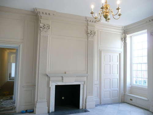
Entrance Hall – Roehampton House
A recent project reminded me of an important point that one is frequently faced with when examining eighteenth century houses. It is something that often causes surprise especially amongst those who believe that interiors from that period often saw an “extravagant use of color”.
An analysis of the decorative schemes in a great number of eighteenth century houses shows that it was quite common for houses to be painted in a single colour throughout. More often than not this would have been selected from amongst the cheapest colours available, those that saw everyday use and, as a consequence, known as the Common Colours. These have been looked at in an earlier post.

A Range of Stone Colours
Of these colours one tends to be found in almost every house that I have ever examined, and that is a colour that was known as Stone Colour.
Stone Colour
Stone colour is a term that one encounters frequently in early documents. When I wrote my dissertation all the information was based on primary sources – on house-painting manuals, specifications and letters of the eighteenth and early nineteenth centuries. Now, with over twenty years of practical experience of examining the decorative schemes in historic buildings I have had a chance to compare theory with practice. It is reassuring to find that, for the most part, the one is reflected in the other.
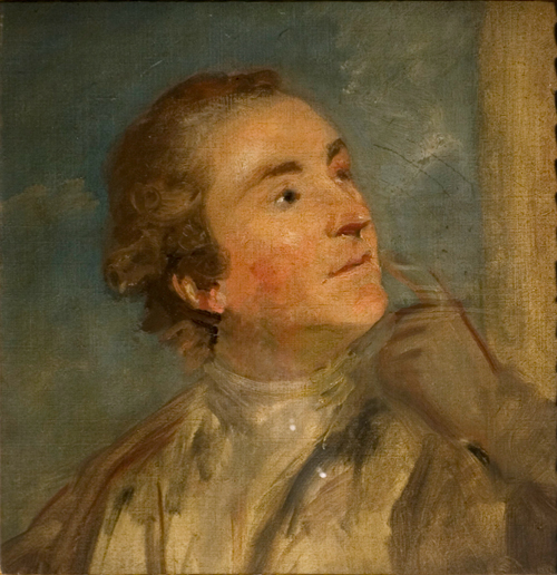
Sir William Chambers (1723-1796) V&A
In 1771, Sir William Chambers, wrote to a client, for whom he was building a house in Berners Street:
“…if you have any Particular fancy about the Painting [of] your principal Rooms be pleased to let me know [.] my intention is to finish the whole of a fine stone Colour as us[u]al excepting the Eating Parlour which I purpose [sic] to finish pea Green with white mouldings & ornaments.”
The same architect, writing to a client, John Colecroft, in 1772 refers to
“our agreement for common stone colouring all over the house”.
He added
“if you mean to have…dead white1 or party colours in your principal floor please to let me know and I will order it accordingly charging you with the difference”.
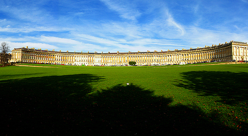
The Royal Crescent, Bath – 1767-1774
In a seven year lease signed on December 19th of the same year between the builder of the recently completed No 14 Royal Crescent in Bath, Samuel Kirkham, and the new resident Charles Hamilton, we are told that:
“The whole house is to be properly painted, the two best rooms in particular four times in oil of the best Dead white colour and the rest of the rooms in the house are to be painted four times in oil of a good stone colour or common white except the outward doors which are to be painted of a dark brown or chocolate colour as the said Charles Hamilton shall choose and the garret doors and ground floor doors are to be painted chocolate colour.”
The taste for stone colour continued into the nineteenth century, as we see in a letter written in 1807 where a house-painter advises his prospective client,
“The most fashionable colours for Plaster walls are The Stone and Gray Colours, for wood work and Cornices White, doors Mahogany and Wainscot2 Colour.”
In fact, the convention continued even longer, for in the 1840s a book of specifications gave instructions to the plasterer working on a Rectory House:
“To colour of a teint of stone colour as shall be directed all the plastered walls and sides of the interior of the building where the same are not papered.”
Even after a fifty year flirtation with wood-graining on joinery there seems to have been a reversion to stone colour for we are told in a work of 1917:
“Woodwork painted stone-colour is serviceable, and far pleasanter in appearance than the common oak-graining often used.”
Recipes for Stone Colour
The wide variety of types of natural stone that could be suggested is reflected in the recipes offered by the various house-painting manuals. Raw Umber (referred to as Turkey Umber3 in several works) appears in many of the recipes. Yellow Ochre too is a constituent in the majority of them, providing a degree of warmth to the colour. Occasionally the earlier recipes will specify a darker variant of ochre known either as Spruce Ochre / Oker or Stone Ochre
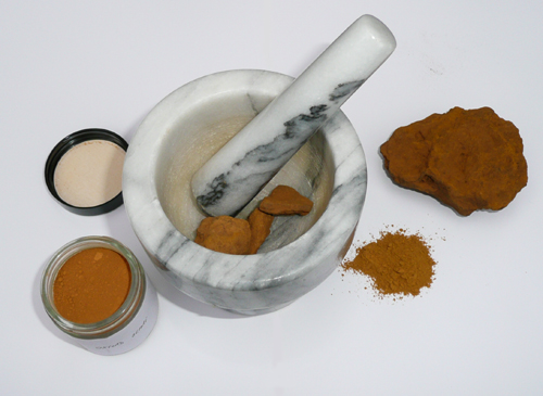
Black was sometimes suggested, especially when a colour similar to Portland stone was required. A recipe of about 1920 suggests that:
“umber and white; or umber, sienna and white; or white, umber and yellow [ochre], make Portland stone.”
Stone colours were often described as being Pale; Warm and Dark, although one would just as readily find Cool versions and almost anything else that broadly resembled stone in its many forms. Under a different name colours such as the well-known Magnolia from the 1950s or Gardenia from the 1970s might also (just) be included in this range.
Although seemingly a very simple kind of colour to make, most modern ready-mixed paints are far too two-dimensional and do not accurately reflect the type of colour achieved by following these early recipes.
On those projects where I am brought in to help with the colours I use paints mixed specially to my requirements at Papers and Paints. They have devised a range of graduated stone colours that answer many needs and allow one to see lighter and darker versions of different stone colours before there is any need for custom-made colours.

Notes
1 A ‘flatted’ white oil finish. A nineteenth century description says that on the second day after the third coat had been applied, a flatting coat was brushed on, consisting of white lead mixed into a paste with turpentine and such pigments as required, to which was added a drier. Owing to the volatility of the turpentine, this soon dried, whilst its solvent action softened the third coat, ensuring a bond between the two layers, leaving the pigment particles held firmly.
2 Wainscot was often known as Oak Colour.
3 The Swiss writer P.F. Tingry said that there were two types of the pigment, Turkey umber and English umber, “the best comes from Turkey, or rather from the island of Cyprus, where it occurs in beds”. This reinforces a seventeenth century description of it being an “earth…dug out of a certain island in the Mediteranian Sea”. Indeed, the North West hills of that island still provide the best source today.
View Larger Map


No comments yet. Be the first!