Lead Colour in the Handel House Museum © Matthew Hollow - with thanks to the Museum The use of colour in the decoration of early eighteenth century interiors was much more straightforward and austere than many...
READ MORE »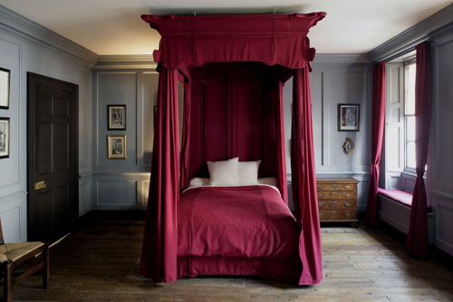
Nov 13th, 2011
|
Patrick |
Colour Ranges | History |
7 Comments
The Hierarchy of Colour in Eighteenth Century Decoration
Nov 7th, 2011
|
Patrick |
Colour Ranges | Paint Technical |
14 Comments
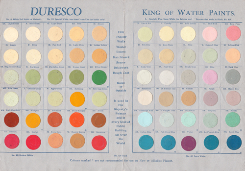
Duresco – King of Water Paints
Duresco - the King of Water Paints "DURESCO on your Walls will bring DIGNITY, FRESHNESS and BEAUTY to your Home". At the very beginning of the twentieth century it was announced that: The Guildhall, London...
READ MORE »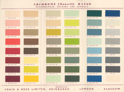
Nov 5th, 2011
|
Patrick |
Colour Ranges |
4 Comments
Archrome (Munsell) Colour Range
Archrome (Munsell) Colour Card - with thanks to Colin Mitchell-Rose The end of the Second World War saw a number of ‘satellite’ new towns develop to the north and east of London – in Hertfordshire1 and Essex...
READ MORE »
Nov 5th, 2011
|
Patrick |
Colour Ranges | Colour Services |
14 Comments
Heraldic Colours (or Tinctures)
Tinctures One of the main aims of heraldry is to provide easily recognisable symbols and this is achieved by using clear colours and by following strict rules. However, not all of these are colours in the true...
READ MORE »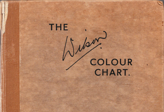
Nov 5th, 2011
|
Patrick |
Colour Ranges | Colour Services |
5 Comments
The Wilson Colour Chart
In 1938 the British Colour Council issued (in collaboration with the Royal Horticultural Society) the first volume of a Horticultural Colour Chart, also called The Wilson Colour Chart after Robert F. Wilson, the...
READ MORE »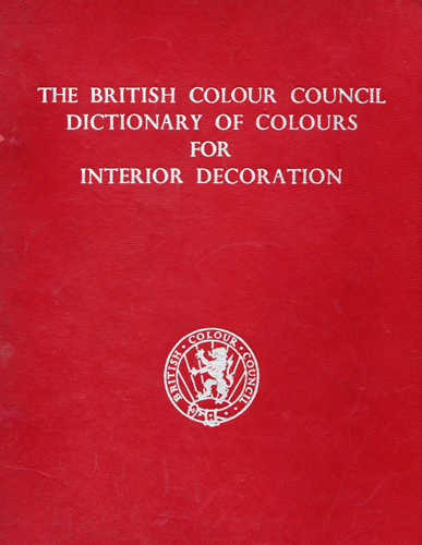
Nov 3rd, 2011
|
Patrick |
Colour Ranges | Colour Services |
7 Comments
Dictionary of Colours for Interior Decoration
The British Colour Council When the British Colour Council came into being in 1930, the declared aims and objects included the placing of colour determination for the British Empire in British hands and the...
READ MORE »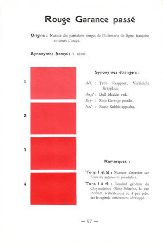
Nov 1st, 2011
|
Patrick |
Aesthetics | Colour Ranges |
No Comments
Horticultural Colours (1)
Rouge Garance passé (Dull Madder Red) - the colour of the faded trousers of the French Line Infantry I have written about important collections of colour on several other occasions - most recently Werner's...
READ MORE »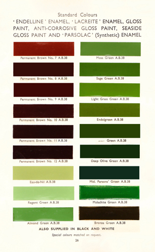
Nov 1st, 2011
|
Patrick |
Colour Ranges | Paint Technical |
2 Comments
Parsons’ Decorative Finishes (15) – ‘PARSONLOID’ Cellulose Lacquer
A previous post has already introduced the subject of a most useful work that was published in the 1930s - Parsons' Decorative Finishes. Subsequently I have used it as a 'prompt' for posts dealing with Water...
READ MORE »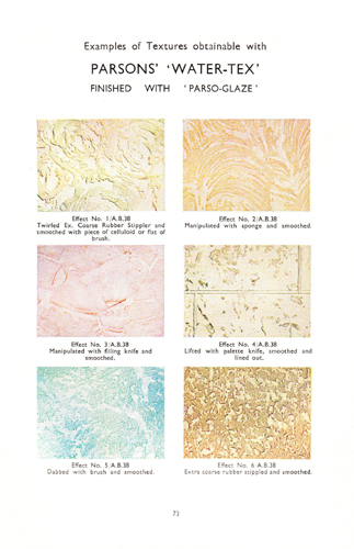
Oct 31st, 2011
|
Patrick |
Colour Ranges | Paint Technical |
2 Comments
Parsons’ Decorative Finishes (14) – ‘WATER-TEX’ Plastic Paint
A previous post has already introduced the subject of a most useful work that was published in the 1930s - Parsons' Decorative Finishes. Subsequently I have used it as a 'prompt' for posts dealing with Water...
READ MORE »
Oct 30th, 2011
|
Patrick |
Aesthetics | Colour Ranges |
7 Comments
The Perfect Grey (or is it “Gray”?)
A sequence of very pale Pure greys produced by Papers and Paints (SC371-SC375). The sequence continues in gradual steps to off-black It is generally accepted that "Grey" is the English spelling for an achromatic or...
READ MORE »
Subscribe using the icon below