In these days, when an ability in Interior Design is often seen to be no more than the selection of a completely impractical ‘chalky paint’ from a ‘Boutique’ paint supplier and an artfully placed pair of old polo boots, it is good to come across some words of common sense on the subject.
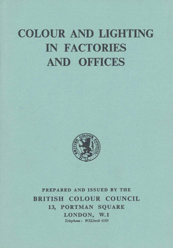
Colour and Lighting in Factories and Offices was first published by the British Colour Council in 1946. The preface, which was written by A.W. Garrett, HM Chief Inspector of Factories during the period of the Second World War, explains the need for such a document:
“Factories were built first to house machines. The conception that they must be places of human habitation for the workers who were to operate the machines came much later. Only today after more than a hundred years of steady progress, after the expenditure of an immense amount of constructive effort and applied research and with the added impetus of two great wars fought to a large extent on the “factory front” have we come to fully realise the implications of that essentially simple requirement that factories should be places fit for people to live in.”
“This booklet tells in detail how one of the most important of these advantages – colour – can be realised. I consider that it has been established beyond question that workrooms – nearly all workrooms – can be given internal colour decoration on walls and machines in a way that will provide aesthetic satisfaction and mental invigoration, realised or unrealised, to the persons there at work. It is not merely a matter of dashing on bright colours at random. Different persons react differently to different colours, and varying situations call each for their proper treatment. Here in this booklet artistic and technical authorities have been enlisted to suggest schemes of colouring and methods of application which may turn the ordinary drab working place into a scene of cultural refreshment.”
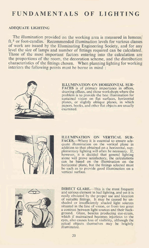
Clearly, this was a popular work as it was reprinted on each of seven successive years and then a revised, second edition was published in 1956.1 It is this latter edition that is being illustrated here. It came in a folder and consisted of two parts – a 40 page booklet with applied colour samples, and a colour card showing 12 paint colours in a matt finish and 13 in a gloss finish.
The rest of this essay has been removed after six years. You can now read more about this in The Anatomy of Colour, published by Thames & Hudson and available from John Sandoe (Books).
View Larger Map


Hello , I run graphic and furniture development activities . I have many books on coulour and learned a lot from you , thank you .
I bought in London years ago ( 70’ or 80’ ) a small dictionary about 8 inc by 4 inc , probably with a black paper cover and a hard cover under maybe not black called A dictionary of colours or Dictionary of colours .
This dictionnary was very simple and well conceived with around 48 pages , 24 chromatic colours , one chromatic colour per page with white and black combinaisons and english names per colour zones .
Do you have an idea about this book ?
Sincerely.
Didier Bernardin.
Thanks Didier.
Yes. I know the book you mean, but cannot think of its title. It is well-planned and laid-out but the colours are terrible. I think that it must be more helpful for printers, as the colours are too bright and crude for decoration.