Welcome to the Website of Patrick Baty
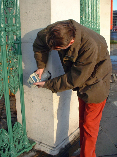
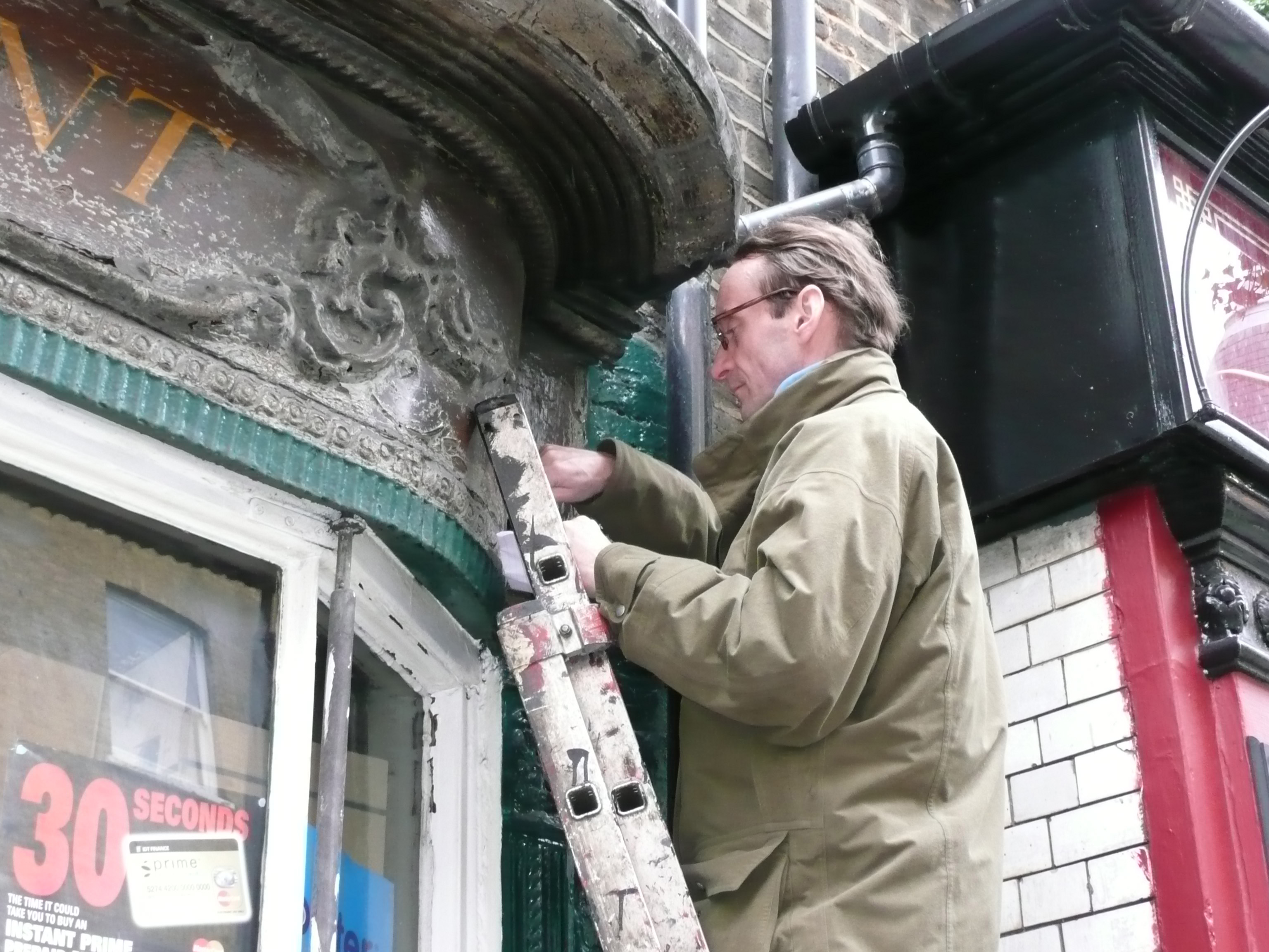
Patrick Baty is one of the UK's leading experts on the history of architectural paint. With a career spanning over four decades, he has dedicated his work to preserving the integrity of architectural heritage through expert consultancy, research, and restoration projects. Whether consulting for historic buildings or writing on the nuances of colour history, Patrick’s expertise is invaluable to anyone seeking a deeper understanding of the past’s painted details.
About His Work
Patrick’s knowledge of architectural paint extends from 17th century buildings to mid-century modern designs. He provides invaluable insight into the restoration and understanding of paint layers, finishes, and colour palettes. His work is sought after by conservators, architects, and property owners who want to protect or restore the historical aesthetic of their buildings.
Featured Projects
Over the years Patrick has worked on many hundreds of projects, a number can be seen on these pages: London Projects, UK Projects and Other Projects