The biggest problem with the naming of colour is the inevitable one of interpretation. Few more so than ‘Bronze Green’, which to some will conjure up a dull dark green while to others it may be similar to the bluish-green of verdigris on corroded copper and bronze. Yet others might think of it as a process – an olive green with a dusting of bronze flakes, designed to suggest tarnished metal.
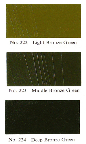
The confusion is greater when one considers that named colours were never a single colour. There was never just the one bronze green, but a limited range of colours of a similar type. Some could be lighter and some very much darker. This was still understood in the 1930s when three versions appear in the first British Standard range of paint colours – Light, Middle and Deep Bronze Green.
One first sees reference to this kind of colour in the early years of the nineteenth century. The architect and designer John Buonarotti Papworth considered that ‘bronze green’ was especially suitable for verandahs and in the description of an illustration that he contributed to Ackermann’s Repository of Arts, Literature, Commerce, Manufactures, Fashions and Politics, of 1812 he said:
‘No colour is so proper for this sort of verandah as the bronze, as it assumes a substantial, though light appearance; every other colour bespeaks it of wooden construction, and is offensive to the eye of taste.’
A pale olive was much favoured at this time for its supposed suggestion of the patinated bronze of the Ancient World and it seems likely that Sir John Soane had this in mind when he painted his dining room in Lincoln’s Inn Fields. The walls were matched to the colour found on a piece of plaster that he brought back from Herculaneum and the mouldings were painted in a light bronze green.
Note the Light Bronze Green on the mouldings
By the middle of the century one encounters bronze green on many painting specifications, for example, in 1859 at the Clothworkers Hall:
The iron railings to be finished bronze green. The entrance doors to be finished bronze green, and twice varnished with best copal varnish.
While in 1865 at the Athenaeum Club:
All the external ironwork next street to be finished Bronze Green as at present.
On that occasion the external woodwork was grained in imitation of oak and mahogany and varnished.
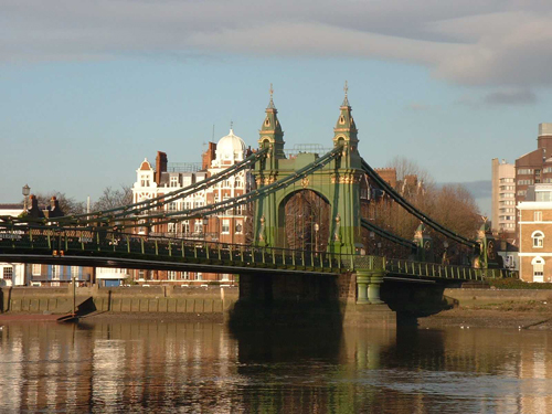
In 1888 Hammersmith Bridge was repainted in three coats of ‘flat bronze green’ and gilded before being varnished. It should be noted that in all the above instances the varnish would have given a high gloss finish to the surface.
The recipes that one finds in nineteenth and early twentieth century painting manuals point to a dark dull green that was produced by mixing black and yellow or black and green and sometimes adding umber.
However, these would have led to a variety of greens all, no doubt, being called bronze green. By the time that ready-mixed paints became available they drew attention to this problem. In the early 1900s, a leading manufacturer, Messrs. Pinchin, Johnson and Company, Ltd., asked 200 prominent decorators and other colour experts to identify the sixty colours most in use. Once they had received the responses they next sent to every one of their competitors four painted variants of each of these sixty colours, or 240 colours in all. The competitor was asked to select which of the four variants was in their opinion best entitled to that name. In the case of bronze green names such as dark green, olive green, and sage green came up as often as bronze green. It was only in 1930 that standardisation was achieved.
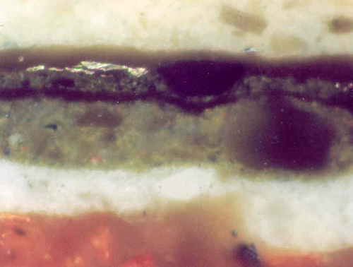
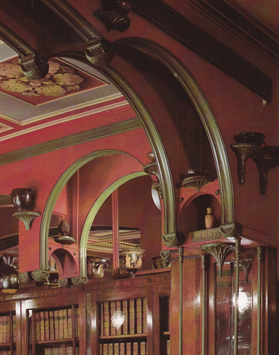
Note the two early schemes of Bronze Green and the bronze powder
While carrying out paint analysis on different surfaces in various parts of the country I have encountered bronze green paint layers at one time or another. On ironwork these have ranged from the South Chancel Aisle Gates of St Paul’s Cathedral; the Tijou Screen at Hampton Court Palace and the railings of The Former Royal Naval College, at Greenwich and Gwydyr House, in Whitehall. The columns of the Non-conformist Hermon Chapel, in Oswestry, Shropshire were initially painted bronze green and gilded.
One also finds it used on joinery and three examples that come to mind are the window sashes of the Coach House at Holmwood House, Glasgow and those of The Travellers’ Club, in Pall Mall and on the door to the Flower Garden at Newhailes, East Lothian. Also in Scotland, I have found it as the 1890s scheme on the embossed wallcovering on the wall of the Entrance Hall of 30 Charlotte Square, Edinburgh.
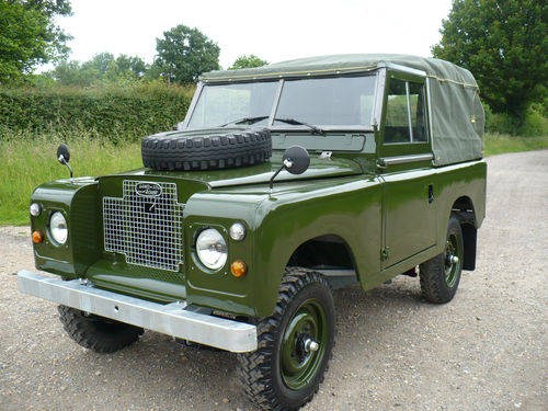
Inevitably bronze green, in particular the British Standard version BS381C 224 Deep Bronze Green, came to be used by the military and also for commercial Land Rovers before the 1970s.
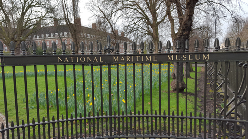
In more recent years it has seen a revival on external ironwork and good examples can be found on ironwork on the Inner Circle of Regents Park; in the Royal Parks, and in various garden squares of South Kensington (e.g. Onslow Square). I also had great success at Greenwich where, in spite of meeting initial opposition to the reinstatement of the bronze green found during an analysis of the railings, it was applied on the perimeters of the former Royal Naval College and the National Maritime Museum. Now that the fuss has died down I suspect that no one notices it.
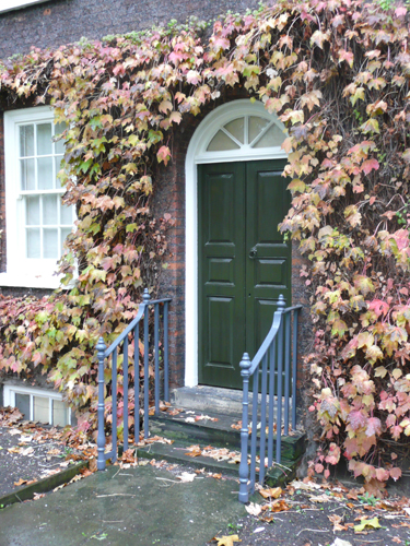
I often find myself specifying it for the front doors of eighteenth and nineteenth century buildings and a recent example was at the Geffrye Museum, in London, where I had identified it during analysis (see top).
Bronzing
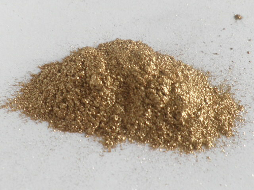
Although less common, and more properly termed bronzed green, one occasionally finds instances of a green having been applied and then dusted with bronze powder. John Claudius Loudon, the Scottish landscape gardener and architect, spoke highly of it:
“…but if we wish it to resemble metal, and not appear of an inferior kind, a powdering of copper or gold dust on a green ground, makes a bronze, and perhaps it is the best colour of all ornamental rails of iron.”1
A painting manual of the same period describes the process:
“To imitate the ground of bronze metal, give your work two coats of this (green) colour, and when nearly dry apply the bronze (powder) to the most prominent parts of the bust with a camel-hair pencil.” 2
A later work suggests:
“If desired, gold bronze may be put on the prominent parts, as on the tips or edges of iron railings.”
When the paint is not quite dry, use a piece of velvet or plush with which to rub on the bronze.
One occasionally encounters this treatment during paint analysis, usually on ironwork but sometimes on timber or plaster mouldings. At Lancaster House, in London, the atlantes supporting the ceiling of the lantern over the Grand Hall were painted a dark green in the 1830s and bronzed lightly on the more prominent areas.
At about the same time the stair balustrade of the sixth Duke of Devonshire’s seaside house on Lewes Crescent, in Brighton, were bronzed. Somewhat later, probably in the 1870s the same treatment was given to the stair balustrade of the Carlton Club, in St James’s.
I can be guaranteed to find Bronze Green in the nineteenth century layers of paint on many front doors and railings when carrying out analysis of British exteriors. Another frequently-found colour is Brunswick Green.
I have mixed paints to match all of the colours mentioned here and they are available at Papers and Paints, in Chelsea.
Notes
1 John Claudius Loudon. The landscape gardening and landscape architecture of the late Humphry Repton, esq: being his entire works on these subjects. 1840.
2A pencil being a thin brush.


Very interesting article, on the use of Bronze Green and its definition. Good to hear that it is being reused in original locations.
Thank you, Stephen. If the situation is right it looks so much better than black on railings. However neighbouring buildings must always be considered.
Thank you for a very comprehensive article, Patrick. I’ve often read of external ironwork being given a bronze finish, but didn’t realise it was so widespread inside as well. Nor did I realise that the textured bronze/gold powder finish was so delicately applied. I had always assumed it was put on quite thickly.
A similar colour was referred to on my visit to South Carolina last week as Charleston Green.
Thanks Joe. Yes. I am sure that many different cultures have a tradition of its use.
I found your article because I am about to paint my Victorian front door bronze green. There is a big difference between the lightest and darkest BS381 variants. Are most of the late Victorian samples you come across nearer the lighter or darker end?
I also have an iron handrail leading to the front door which I was planning to do standard gloss black but may now do bronze green too. The Greenwich railings look very matt, is that more appropriate than gloss?
You have an interesting blog here.
Thanks,
Simon
Just re-read and picked up that ironwork would be varnished to a high gloss finish. The Greenwich railings do look quite matt though.
When stripping the old paint from my handrail the very bottom layer was a light Brunswick green.
Thank you Simon. Most of the examples of Bronze Green that I encounter on railings tend to be of the darker type. Railings were seldom varnished, although woodwork and flat expanses of ironwork can frequently be seen with a coat of gloss varnish applied. Gloss paint starts off by looking shiny, but after a few years exposure to the elements dulls down. That is what you are seeing at Greenwich, where the paint has been up for some time.
Very useful. There’s a reference to the original railway swing bridge over the Rother at Rye, Sussex being painted green and gold in 1851, and I modelled this some years ago in 7mm scale, mainly green with gold decoraation. This was before I saw your pic of Hammersmith bridge which is a sort of confirmation. (Phew)
The SER painted their locos ‘holly green’ in the 1840s to 1870s. I’d appreciate any thoughts you have on what that looked like. Modern ‘hollybush’ greens seem far too blue to my eye.
Regards, Dan
Thanks Dan. Holly Green would have been a Brunswick Green i.e. a green produced by mixing Prussian Blue and Chrome Yellow. There were many different variants, some of which would have been bluer than others.